

This package is intended to help data scientists and decision-makers understand the potential value of churn prediction models depending on how many customers are being targeted by a campaign.
You can install modelimpact with:
install.packages("modelimpact")Or you can install the development version from GitHub with:
# install.packages("devtools")
devtools::install_github("PeerChristensen/modelimpact")The first three functions aim to provide information about the
business impact of using a model and targeting x % of the customer base.
These functions accept the following arguments (required ones in
bold):
x - a data frame fixed_cost - fixed costs (defaults to 0) var_cost - variable costs (defaults to 0) tp_val - true positive value (defaults to 0) prob_col - the variable containing
target class probabilitiestruth_col the variable containing the
actual classprofit_thresholds() accepts the following arguments:
x - a data frame var_cost - variable costs prob_accept - Probability of offer being accepted.
Defaults to 1. tp_val - The average value of a True Positive.
var_cost is automatically subtracted. fp_val - The average cost of a False Positive.
var_cost is automatically subtracted. tn_val - The average cost of a True Negatives fn_val - The average cost of a False Negatives
prob_col - The column with
probabilities of the event of interest truth_col - the column with the actual
outcome/class. Possible values are ‘Yes’ and ‘No’# Parameter settings
fixed_cost <- 1000
var_cost <- 100
tp_val <- 2000library(modelimpact)
library(tidyverse) # dplyr for wrangling, ggplot2 for autoplot()
theme_set(theme_minimal())Every analysis function returns a tidy, classed data frame.
That means you can inspect the numbers directly or hand
the result straight to autoplot() to get a ready-made,
sensible plot — no manual ggplot() code required.
(autoplot() comes from ggplot2; the plot_*()
functions are equivalent wrappers if you prefer.)
The bundled predictions dataset has one row per
customer: the model’s predicted probability of churn (Yes),
the complementary probability (No), the predicted class
(predict) and the actual outcome (Churn). The
cost and value assumptions defined above (fixed_cost,
var_cost, tp_val) are reused throughout.
Question it answers: As we target more customers (from most to least likely to churn), how do our cumulative costs and cumulative revenue grow, and where do they cross?
predictions %>%
  cost_revenue(
    fixed_cost = fixed_cost,
    var_cost   = var_cost,
    tp_val     = tp_val,
    prob_col   = Yes,
    truth_col  = Churn) %>%
  autoplot()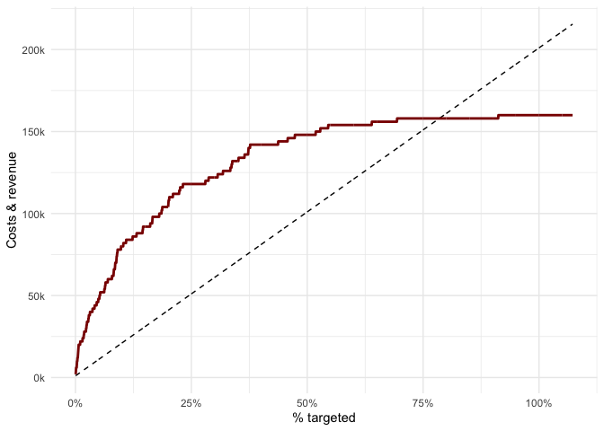
Customers are ranked by predicted churn probability, then we walk
down the list. The dashed line is cumulative cost (it
rises in a straight line — every extra customer contacted costs the same
var_cost). The solid red line is cumulative
revenue, which climbs steeply at first — the top of the list is
dense with real churners we save — then flattens once the genuine
churners are exhausted and we are mostly contacting non-churners. The
vertical gap between the two lines is profit: widest early on, shrinking
as we target deeper.
Question it answers: What percentage of customers should we target to make the most money, and at what point does targeting more start to destroy value?
predictions %>%
  profit(
    fixed_cost = fixed_cost,
    var_cost   = var_cost,
    tp_val     = tp_val,
    prob_col   = Yes,
    truth_col  = Churn) %>%
  autoplot()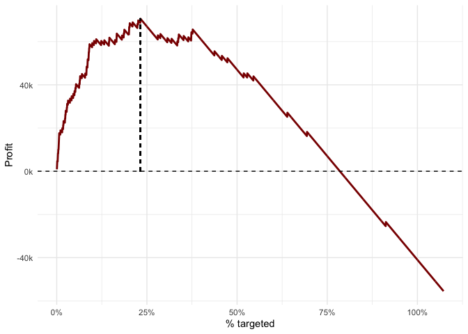
This is simply the gap from the previous plot drawn on its own.
Profit rises while each additional slice of customers still contains
enough churners to more than cover the contact cost, peaks (the dashed
vertical line marks the profit-maximising share), then declines as we
start paying to contact people who were never going to churn. Past the
point where the curve crosses zero, targeting more customers means an
overall loss. Use impact_summary() or
break_even() (below) to read the exact optimum and
break-even share.
Question it answers: How efficiently is each euro spent being converted into return, and how fast does that efficiency fade as we go down the list?
predictions %>%
  roi(
    fixed_cost = fixed_cost,
    var_cost   = var_cost,
    tp_val     = tp_val,
    prob_col   = Yes,
    truth_col  = Churn) %>%
  autoplot()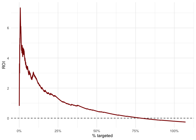
ROI is (revenue − cost) / cost, so unlike profit it is a
rate, not an absolute amount. It is highest at the very top of
the list, where a small spend captures the densest concentration of
churners, and falls monotonically as we add lower-value customers. The
point where it crosses zero is the same break-even share seen in the
profit plot. ROI answers a different question from profit: profit tells
you how much to make, ROI tells you how efficient the
spend is — a campaign can be highly efficient (high ROI) while targeting
so few people that total profit is small.
Unlike the three functions above, profit_thresholds()
answers a different question and should not be read the same way. Rather
than ranking customers and reporting the impact of targeting the top
X %, it sweeps a probability cutoff from 0 to
1, builds a full confusion matrix (TP/FP/TN/FN) at each cutoff, and sums
a payoff using per-cell values (tp_val,
fp_val, tn_val, fn_val) and
prob_accept.
Question it answers: If we must convert the model’s probabilities into a yes/no decision, which probability cutoff maximises payoff given the value of each confusion-matrix outcome?
Two things to keep in mind:
profit() (it penalises
missed churners via fn_val, applies
prob_accept, and uses no fixed_cost), so its
optimum will generally not coincide with the peak of the
profit() curve.predictions %>%
profit_thresholds(var_cost = 200,
prob_accept = .7,
tp_val = 2000,
fp_val = 0,
tn_val = 0,
fn_val = -1000,
prob_col = Yes,
truth_col = Churn) %>%
autoplot()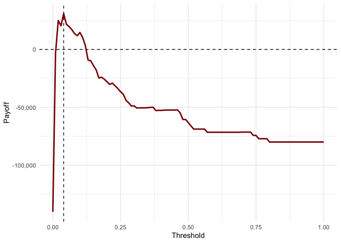
The dashed vertical line marks the payoff-maximising threshold. Here
the penalty for missed churners (fn_val = -1000) still
pushes the optimum to a fairly low cutoff — it is worth contacting many
people, including some false positives, to avoid letting churners slip
through. Raising fn_val toward zero (making missed churners
less costly) would move the optimal threshold further right — i.e. be
more selective (remember: a higher threshold means fewer people
contacted). Raising var_cost, or making false positives
more costly (a more negative fp_val), would do the
same.
Each of the following also returns a classed data frame that works
with autoplot().
Question it answers: Give me the one-line executive answer: how much profit, at what target share, how many churners caught, and what happens if we just contact everyone?
impact_summary() rolls the ranking-based views up into a
single row.
impact_summary(predictions,
    fixed_cost = fixed_cost,
    var_cost   = var_cost,
    tp_val     = tp_val,
    prob_col   = Yes,
    truth_col  = Churn)
#> # A tibble: 1 × 6
#>   optimal_pct max_profit roi_at_optimum capture_at_optimum breakeven_pct
#>         <dbl>      <dbl>          <dbl>              <dbl>         <dbl>
#> 1        21.6      70600           1.49              0.738          73.2
#> # ℹ 1 more variable: profit_target_all <dbl>
optimal_pct is the profit-maximising share to target,
capture_at_optimum is the fraction of all churners caught
at that point, breakeven_pct is how far you could go before
losing money, and profit_target_all shows the loss you
would make by contacting the whole base indiscriminately.
Question it answers: If we target the top X % of customers by score, what fraction of the actual churners do we catch?
predictions %>%
  cumulative_gains(prob_col = Yes, truth_col = Churn) %>%
  autoplot()
The dashed diagonal is what random targeting would achieve (target 20 % of people, catch 20 % of churners). The further the red curve bows above that line, the better the model concentrates real churners near the top. Here, targeting the top ~20 % already captures roughly 70 % of all churners.
Question it answers: How many times better than random is the model at each depth of targeting?
predictions %>%
  lift_curve(prob_col = Yes, truth_col = Churn) %>%
  autoplot()
Lift is the gains curve divided by the random baseline. A lift of 3
at the 10 % mark means the top decile contains three times as many
churners as you would expect by chance. It starts high and decays toward
1 (the dashed line), which it must reach once 100 % of customers are
targeted. (The function is called lift_curve() to avoid
clashing with purrr::lift().)
Question it answers: Which slices of the customer base actually make money, and where exactly do additional customers start costing more than they return?
predictions %>%
  marginal_profit(fixed_cost = fixed_cost,
                  var_cost   = var_cost,
                  tp_val     = tp_val,
                  prob_col   = Yes,
                  truth_col  = Churn) %>%
  autoplot()
Where the cumulative profit curve shows the running total, this shows the profit contributed by each decile on its own. The first bar to drop below zero is the point of diminishing returns — every bin from there on subtracts from total profit. Reading it left to right tells you precisely how deep it is worth going.
Question it answers: Given two or more candidate models, which one delivers more business value at the share of customers we actually intend to target?
compare_models() computes a chosen curve for several
probability columns and labels each by its column name, so models can be
compared on money rather than AUC alone. The bundled data only contains
one model, so here we manufacture a deliberately weaker
second model (half real signal, half random noise) to illustrate a
meaningful comparison. (Comparing the built-in Yes and
No columns would not be meaningful —
No is just 1 - Yes, i.e. the same model ranked
backwards, so its curve falls below the random diagonal.)
set.seed(42)

model_comparison <- predictions %>%
  mutate(strong_model = Yes,
         weak_model   = 0.5 * Yes + 0.5 * runif(n()))

model_comparison %>%
  compare_models(prob_cols = c("strong_model", "weak_model"),
                 truth_col = Churn,
                 metric    = "gains") %>%
  autoplot()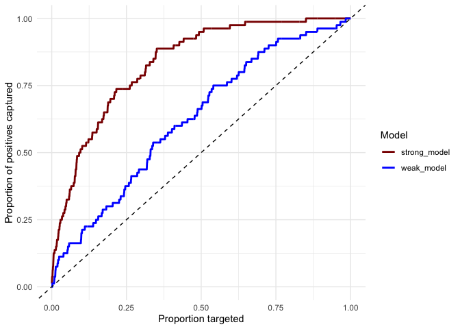
Each line is one model’s cumulative-gains curve; the dashed diagonal
is random targeting. The higher a curve sits, the more
churners that model captures for the same targeting effort — so
strong_model clearly dominates weak_model,
which in turn still beats random. At 20 % of customers targeted,
strong_model captures ~70 % of churners versus ~30 % for
weak_model. Swap metric for
"profit", "roi" or "lift" to
compare on those instead.
All return classed data frames; those with an autoplot()
method are noted.
break_even() — the optimal and break-even targeting
points (numbers, for reporting).roc_pr() + autoplot() — ROC /
precision-recall data, with an optional iso-profit operating point via
plot_roc(slope = ...).confusion_payoff() — confusion matrix and payoff at a
single chosen threshold.payoff_grid() — payoff across a grid of thresholds and
acceptance rates (ready for a heatmap).bootstrap_profit() + autoplot() —
confidence bands around the profit curve.tornado() — sensitivity of maximum profit to each
cost/value assumption.